It’s a Thursday morning, and you reach your work desk with your morning cup of coffee. You have recently started email marketing as a part of the digital marketing strategy for your business. Intrigued to know the results of your latest email campaign, the first thing you do is check the performance metrics from the emails you sent a day before. You observe that the open rates are decent, but the engagement rates or click-through rates are low. The time and effort you invested in creating and running your email campaign is not paying off with your current emails.
On the other hand, you keep hearing that “Email is still king,” and that email can yield a record ROI of a whopping 3800%.
So, why are your emails not getting you the desired results?
According to a statistics report by Radicati Group, the total number of business emails sent and received in a day will exceed 293 billion in 2019 and grow to over 347 billion by the end of 2023. This means an ideal email user receives more than 40 business emails in a day. Hence, it is of utmost importance that as an email marketer, you send emails that stand out in your subscribers’ crowded inbox.
To make an impact on your subscribers, your emails need to be well-crafted, alluring and highly engaging. You also need to make sure your emails are free of errors and well designed, as poorly designed emails can be a big turn-off.
So, before you create your next email, go through these common email design mistakes that you must avoid in order to gain maximum ROI.
Mistake 1: Your Email Has an Offbeat and Irrelevant Header Image
As the saying goes, “a picture is worth a thousand words.” Images are a crucial part of your email. The header image is the first thing that users notice, and it can either make or break your email design.
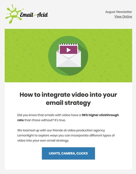
Your email should have an eye-catching image that would lure the users to look at the details. The image must make your email look attractive and support the key message you wish to convey. Here is a good example of an email header image:

Email on Acid has highlighted the purpose of the email through the header image, followed by engaging copy and an innovative call-to-action (CTA).
Mistake 2: Your Email Design is Not in Line with Your Branding
Your email subscribers should be able to immediately recognize your brand when looking at your emails. If there is no logo or consistency in brand color usage, your subscribers will not connect your emails with your brand. Also, your email design and layout should be aligned with your website design.
Include your company logo at the top of your email in a way that it is prominently visible and use the colors and pictures that match your brand image. The content of your email must be consistent and reflect your brand’s core mission and values.
Mistake 3: The Fonts in Your Email Are Hard to Read
Including multiple fonts or overly elaborate fonts in your email copy will make the text hard to read.
Ideally, your email should use no more than two different fonts, preferably from the serif and sans-serif font family. Use simple fonts such as Verdana, Arial, Times, Tahoma and the like to make it easy for the users to read. For best readability, the font size for the header text should be 22–24pt and the body copy should be 12–16pt. Take a look at this clean email that uses a serif font for the headers and a sans-serif body font.
-2.png?width=533&name=unnamed%20(1)-2.png)
Mistake 4: The Colors in Your Email Are Too Busy
The colors you use in your email design must look professional. They must be aligned with your brand and must give your email an appealing look. Use up to a maximum of 2–3 colors, and if you wish to use more, stick to light, eye-pleasing colors.
Mistake 5: Your Email Has Spelling Errors
Spelling mistakes are a big no-no for emails. Your email copy, headline, CTA text, footer and everything else should have error-free grammatically-correct text. Maintain a hierarchy for the readers to glance at your emails and grasp the important information. Double-check for spelling and formatting before hitting the send button.
Mistake 6: The Links Are Broken
A link that takes your email users to your website, landing page or social media page is the most important thing for email conversions. If your emails have links that do not land on the right page or show an error when clicked, it leaves a bad impression on the user. Moreover, including too many links and CTAs could confuse your readers as to what they’re supposed to do.
Mistake 7: Your Email Takes Too Long to Load
If your emails have too many design elements or images, it will take more time to load. Moreover, the loading time for design heavy emails varies for different email clients. If your user must wait for too long to view the email, or if the image does not display, they are more likely to delete your emails straight away.
Mistake 8: The Email Copy is Too Long
Keep your content or copy crisp and concise. If the copy is too long and contains too much jargon, readers will lose interest. Include only relevant information in your emails, and if there is more you want to convey, create a blog post or infographic that your email can link to.
Mistake 9: The CTA is Buried Under Too Many Design Elements
The number of clicks on the email’s call-to-action informs the click-through rate, which is an important metric for determining the success of your email campaigns.
Your CTA needs to stand out in the email, instead of being lost in your email design. To help it stand out, use contrasting colors to highlight your CTA button. Check out this example of email CTA from Formstack, which contains a prominent CTA prompting the recipient to Register for their webinar.
-1.png?width=486&name=unnamed%20(2)-1.png)
Mistake 10: Your Email is Not Designed for Mobile Devices
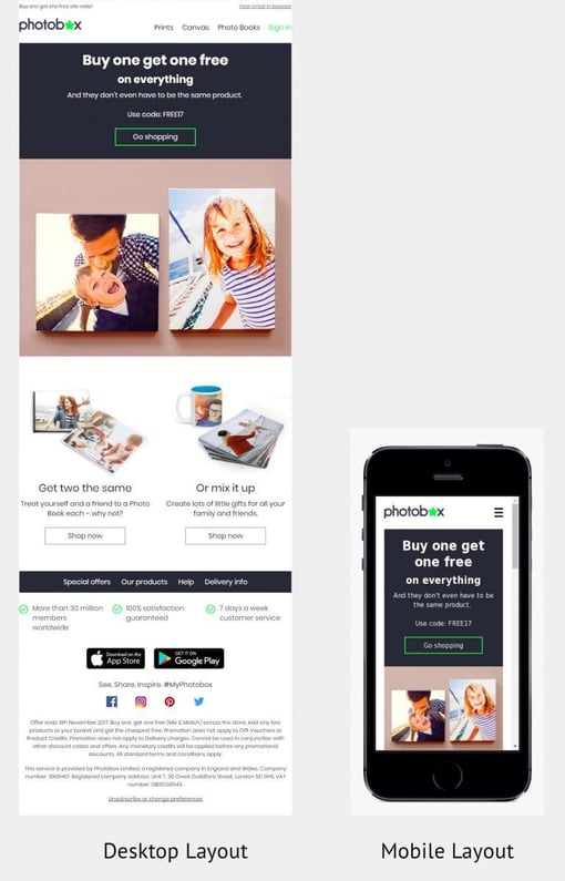
Nearly half of all emails are now opened on mobile devices. This means your emails need to look flawless on desktop as well as mobile devices. It is, therefore, necessary to design emails that are responsive and can adapt to any screen size.
Make the mobile version of your emails single-columned with a maximum width of 500 to 600 px. Test for responsiveness on multiple devices and email clients to ensure it is rendered smoothly. Here is an example of the desktop and mobile version of an email from Photobox.

Wrapping Up:
These are some major reasons your emails are not serving their purpose. Go back to your emails, look for the flaws and take measures to rectify them.
In a nutshell, a well-designed email should have a clear and concise copy, minimum design elements, attractive images and prominent calls-to-action. Keep these design elements in mind while designing your next emails, and you are sure to hit the bullseye!
Chintan Doshi
Chintan Doshi is Head of Operations at InboxArmy LLC. He has been in the email marketing industry for the last 7 years. Chintan is connected to InboxArmy, a professional email marketing agency that specializes in providing advanced email marketing services from email production to deployment. Chintan's success track...


