

It doesn’t matter how hard you've worked to increase your website visits or how complex the campaign that led visitors to your landing page was — when push comes to shove, it’s up to your landing page to convince visitors to take the next step.
When designing or optimizing your landing pages, weigh what you’re offering against what you’re asking for and make sure you’re adding value for your prospects before asking for anything from them.
Here are seven essential elements of high-converting B2B landing pages that you should incorporate into your design, copywriting and tactical execution.
7 B2B Landing Page Best Practices
1. Provide clear and concise header messaging.
More often than not, B2B products are complex and explaining the way they work is difficult. A clear value proposition with meaningful and direct copy can drastically improve conversion rates.
One of the best ways to do this is by using powerful words or invoking emotions that will resonate with your personas. Here’s a good example of this from WhenIWork:
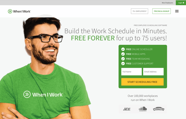
This page clearly conveys what the company does and what challenges their solution addresses.
2. Provide a valuable tool or offer.
You can deliver a valuable offer to a site visitor in a number of ways — from content like a white paper, e-book or webinar to a more developed tool. Regardless of the method, make sure the content you’re providing in exchange for any information from a visitor is an equal exchange for your knowledge or expertise.
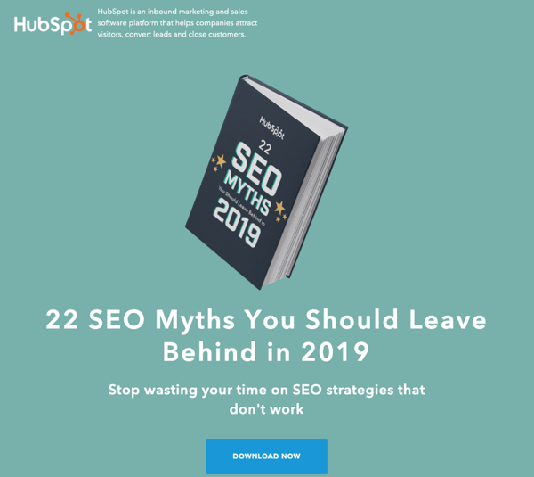
One of the best examples of a great offer that has withstood the test of time is HubSpot's Website Grader, which has been a backbone of its lead generation efforts for the entire life of the company to date:
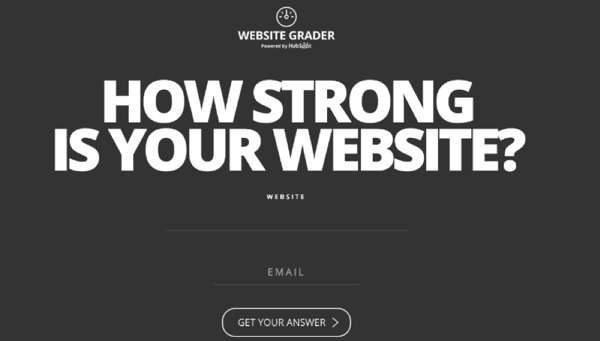
In exchange for an email address, this tool analyzes your website performance and provides immediately actionable advice, exemplifying the idea of providing more value than you take.

3. Include a video.
An Business 2 Community article found that including videos on landing pages increased conversions by 12–86%. Visuals and animations can be used to clearly communicate the value proposition of your product or service and engage with page visitors, as demonstrated by Vidyard’s landing page pictured below:
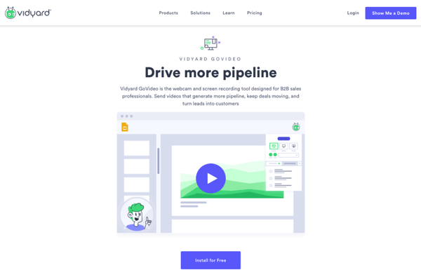
The video explains the value proposition of the Vidyard GoVideo and then demonstrates some of the ways the product can be used and how a business can benefit from it. This allows viewers to visualize exactly how they can use the tool, and by incorporating the features discussed like an ending CTA the video acts as a proof-of-concept.
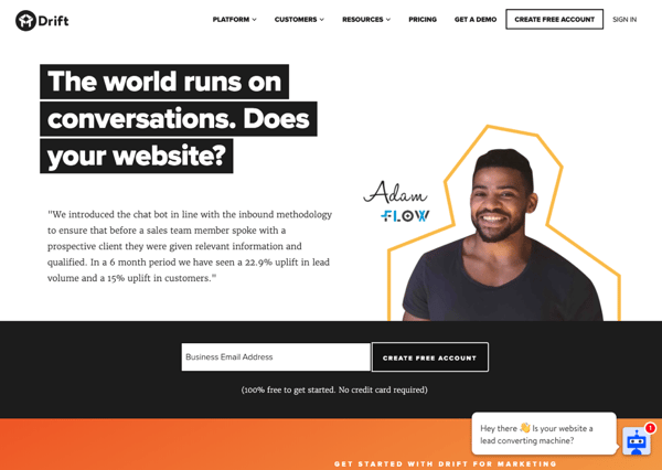
4. Use trustmarks.
Building trust is one of the most important responsibilities of an inbound marketer, and landing pages are a great medium to help you do so. You can build trust through the incorporation of customer logos, customer testimonials and/or partner testimonials.
Take the examples from Drift’s website below.
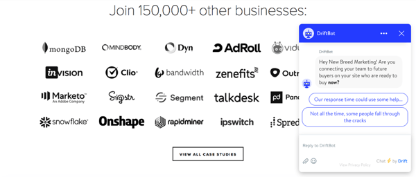
On Drift’s homepage, they display a collection of business logos from companies that use their chatbot. This instills trust by confirming their product is tried and true. If the viewer still isn’t convinced, they can visit the case studies page to get more stats or start a conversation with the chatbot that’s present across Drift’s site.
In addition to the case study page, Drift also includes testimonials on many other site pages. All of the testimonials feature quotes relevant to that page’s content, verifying the marketing information.
5. Provide clear CTAs (calls to action).
Wouldn't it be nice if your site visitors knew exactly what you wanted them to do next? Unfortunately, you can't expect site visitors to infer what steps you'd like them to take. You need to show them. This is where great design can become an asset in helping create the visual queues that will show a visitor the exact action you’d like them to take next.
Look at the example from scheduling software Deputy:
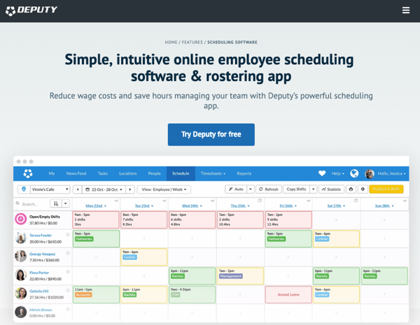
The call-to-action “Try Deputy for free” clearly indicates the desired action and stands out from the text around it due to its button format. Furthermore, the video below shows the software in use, conveying exactly what the site visitor would be getting by clicking on the CTA.
6. Remove navigation elements.
In many situations, you will want to remove the additional header and footer navigation from your landing page. There are some use cases, especially when using paid tactics, where this might not always apply. But generally, when linking from a call-to-action to a gated offer on your website, you don't want people getting distracted by your other site content.
If you’re browsing HubSpot’s resource library and decide to view the details on one of their resources, you’ll notice this tactic in use.
The landing page will open in a new tab, and the only thing on that page will be content framing the offer and the form to download it.
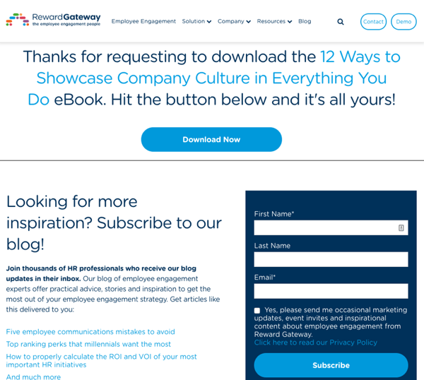
7. Use thank you pages to your advantage.
Finally, not using the redirect from your thank you page is a significant lost opportunity. The thank you page allows you to reintroduce the main header and footer navigation and give your prospect some key next steps, such as following through on the expectation and delivery of the promised content and having the opportunity to share your offer.
Here is a great example of an effective thank you page from Reward Gateway that allows the visitor to download the offer and then engage further by subscribing to Reward Gateway’s blog:
The Takeaway
As with any optimization campaign, these seven tactics will work better for some businesses than others; be sure to carefully A/B test your pages to see what resonates best with your prospects and drives the most conversions for you.
Access our webinar on the Methods, Metrics and Merits Behind Conversion Optimization to learn more tips and tricks for optimizing your lead generation assets!
This post was originally published on September 22, 2015.